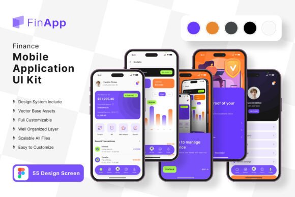
FinApp Finance App Mobile UI KIT: A Designer's Toolkit
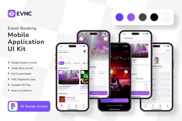
Imagine launching a polished, professional finance application in days, not months. The FinApp Finance App Mobile UI KIT is a comprehensive design system crafted to make that a reality. This powerful collection of 55 high-quality templates provides a robust foundation for building sleek, user-friendly mobile apps, saving you from the blank canvas struggle and letting you focus on customization and innovation.
At its core, this UI kit is about efficiency and quality. It’s a curated design asset that includes over 80 meticulously crafted UI elements, all built with 100% vector layers in Figma. This means every component, from buttons and charts to navigation bars and data displays, is fully scalable and editable. You can easily adapt colors, fonts, and layouts to match any brand identity, ensuring a cohesive and modern typography feel across your entire application.
Practical Applications for Your Projects
While its name suggests a finance focus, the clean, professional aesthetic of this kit makes it versatile for numerous creative projects. Consider how it can streamline your workflow for:
- Fintech & Banking Apps: The primary use case. Design interfaces for budgeting tools, investment dashboards, and payment gateways with confidence.
- Corporate & SaaS Dashboards: The structured layouts are perfect for admin panels, analytics platforms, and B2B software where clarity is key.
- Modern Web Design & Prototypes: Use the screens as a starting point for responsive website layouts or interactive prototypes to pitch ideas to clients.
- Brand Identity & Presentation Design: The consistent visual language can inspire logo design, business cards, or investor deck templates that require a trustworthy, professional look.
Tips for Choosing and Using a UI Kit
Selecting the right design assets is crucial. When evaluating the FinApp Finance App Mobile UI KIT or any similar resource, keep these points in mind:
First, assess the design flexibility. A kit that is fully editable in a tool like Figma, with organized layers and symbol objects, will integrate seamlessly into your process. Second, check the visual coherence. Does the style align with your project's mood—whether it's minimalist, bold, or corporate? This kit’s pixel-perfect designs and free font pairing offer a great starting point for a professional presentation.
Finally, consider the scope of elements. A library of 80+ UI components means you likely won’t need to create basic elements from scratch, accelerating your path from concept to a high-fidelity prototype. Remember, all images in previews are for demonstration; your final product will be defined by your unique content and branding.
Choosing a well-designed typeface or a comprehensive UI kit is an investment in your project's visual integrity. It establishes consistency, enhances user experience, and communicates professionalism at a glance. The right toolkit doesn't just make things look better—it makes the entire design process more focused, efficient, and enjoyable, allowing your creative vision to take center stage without technical distractions.